


PRINTABLE RATIO EDITIONS FOR POSTERS & WALL ARTS

You will get 5 hi-res (300dpi quality) JPEG files and ‘’How to print Manuel Document’’ ,  in the following sizes/aspect ratios for instant download/print:

Ratio 2 x 3 file to print:


Inch: 4×6 / 6×9 / 8×12 / 10×15 / 12×18 / 16×24 / 24×36

Cm: 10×15 / 20×30 / 30×45 / 40×60 / 60×90

Ratio 3 x 4 file to print:


Inch: 6×8 / 9×12 / 12×16 / 15×20 / 18×24 / 21×28 / 24×32 / 27×36

Cm: 15×20 / 30×40 / 45×60 / 60×80

Ratio 4 x 5 file to print:


Inch: 8×10 / 12×15 / 16×20 / 24×30

Cm: 8×10 / 12×15 / 40×50 / 72×90

Ratio 11 x 14 file to print:


Inch: 11×14 / 22×28
Cm: 55×70

International ISO file to print:

A5 / A4 / A3 / A2 / A1 / 50X70

*(Optional) Square Ratio file to print: 

(If the product images have a square size images, this file will be in your package.) Any size up to 36×36 inches


➤ If you require an different size or file format for free, please get in touch. We’re happy to help! 

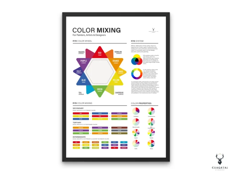
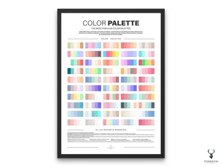
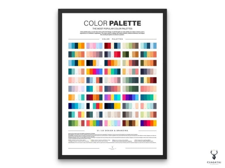
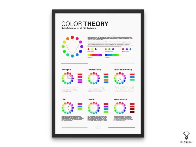
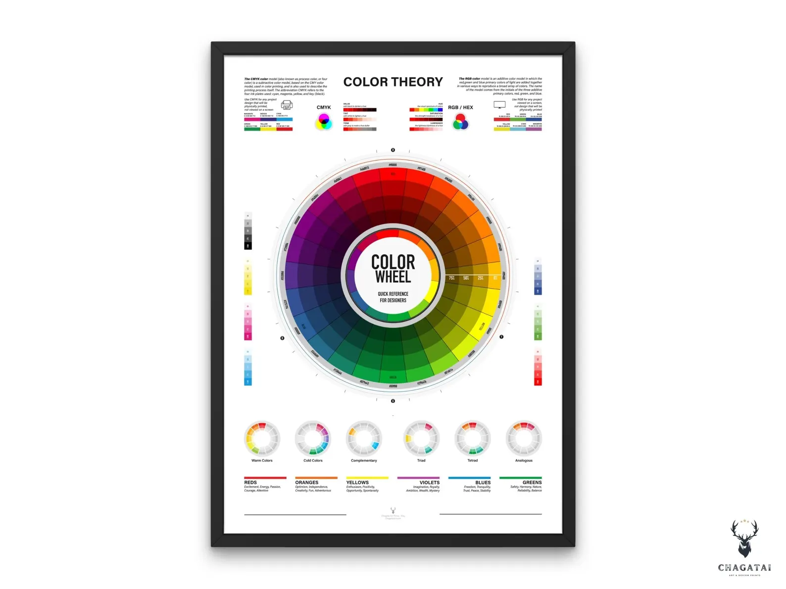
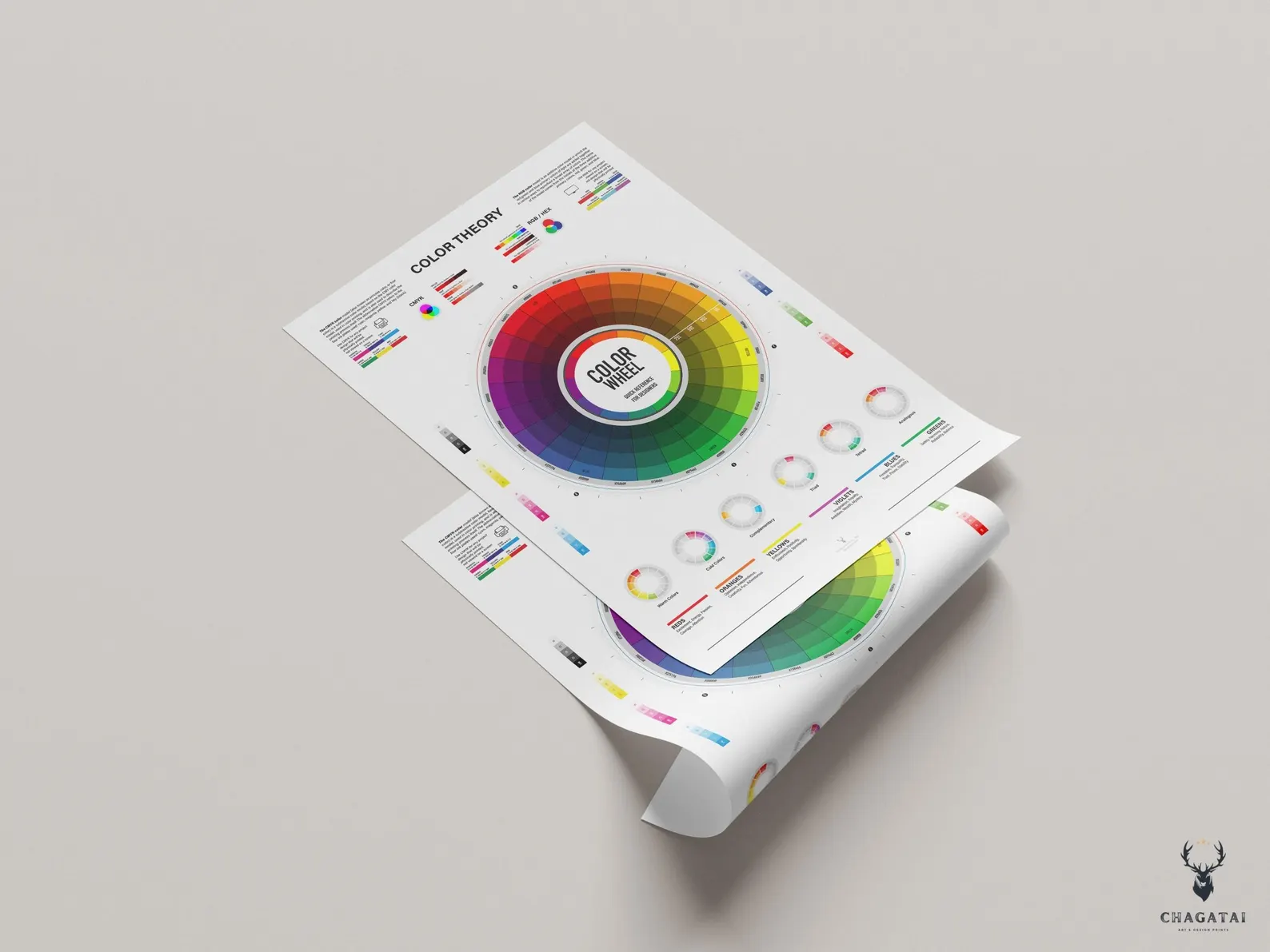
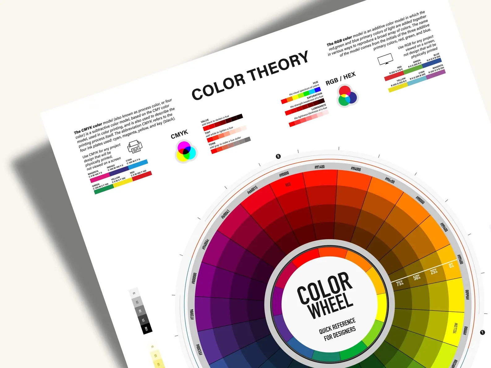
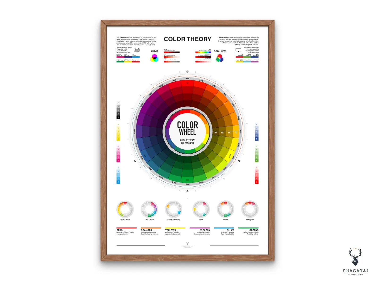
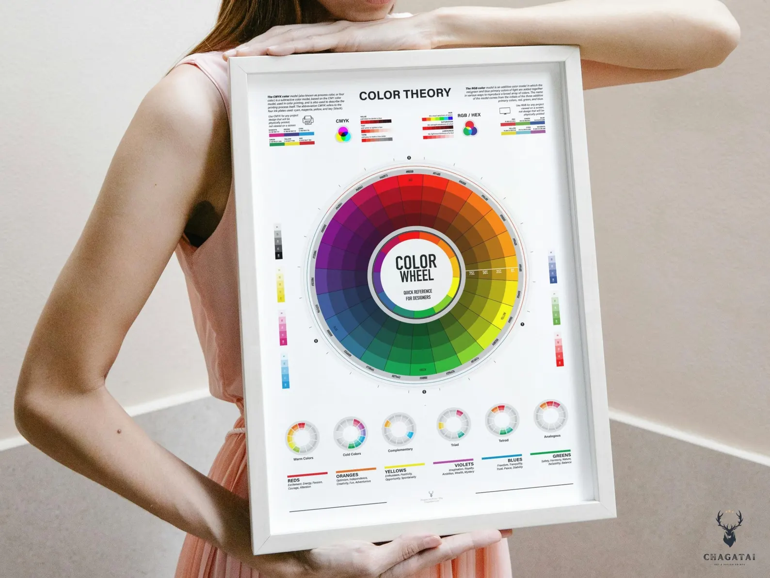
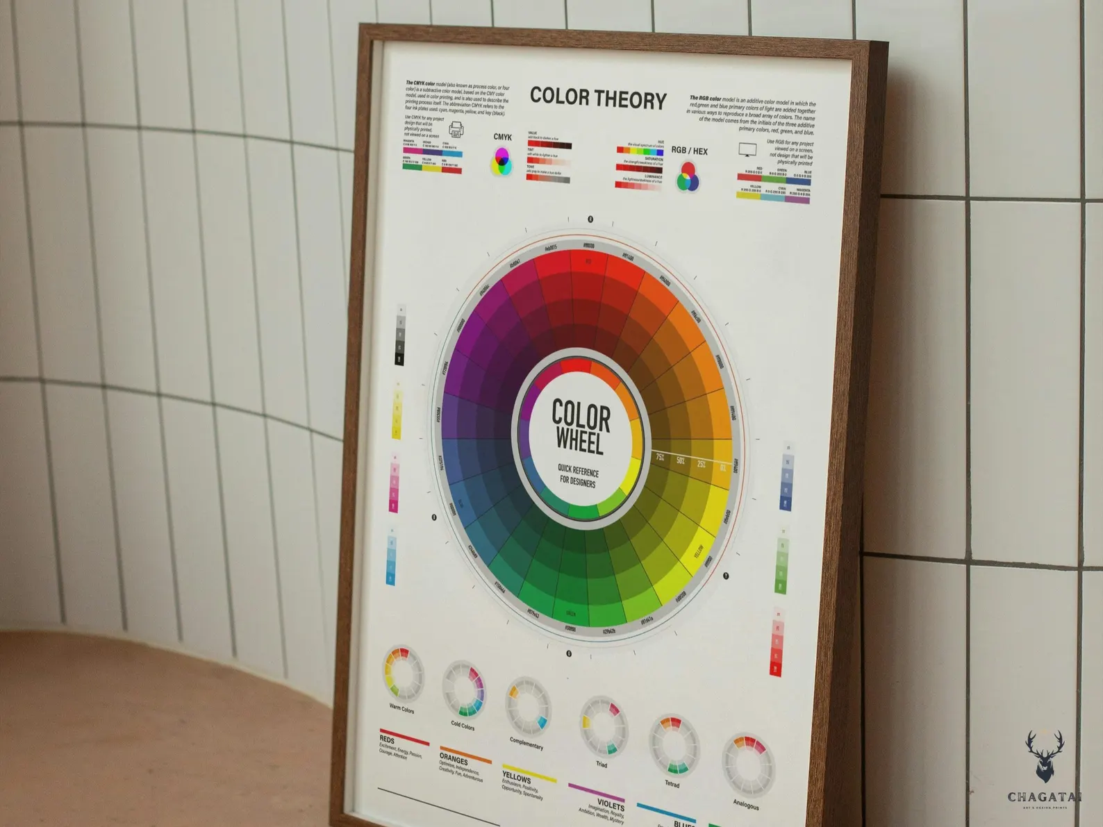
Transform your creative space with this Color Wheel poster — a complete Color Theory reference designed for artists, designers, and students. This wall chart covers everything from CMYK and RGB color charts to printable color theory cheat sheets that make understanding color simple. Featuring color harmony charts (complementary, triad, analogous), warm and cool colors, and detailed guides for color mixing and matching, it’s the perfect quick reference for painting, digital design, interior styling, and branding.

Whether you’re a graphic designer working with digital palettes, an artist mixing paints, or a teacher creating lessons in design classrooms, this Color Wheel Reference Guide provides clarity and inspiration. Printed in high resolution, this Artist Color Theory Wall Art is both educational and decorative — making it ideal for studios, offices, and classrooms.
Check our all Color Theory Posters

 

19 reviews for Color Wheel – Color Theory Chart Poster for Designers

  1. Rated 5 out of 5

    Ava Reynolds –

    This Color Wheel is exactly what I wanted for my desk. The Color Theory layout blends CMYK and RGB references with clear harmony diagrams, so picking complementary or triad palettes is fast. The HEX callouts are spot on, and the warm vs. cool scales help when moving from brand design to illustration. Great balance of education and wall-worthy design.

  2. Rated 5 out of 5

    Michael Torres –

    Printed large for my design class—students finally understand analogous vs. complementary relationships at a glance.

  3. Rated 5 out of 5

    Noah Bennett –

    Love that it includes both RGB/HEX and CMYK for print handoff. Makes brand color conversions painless.

  4. Rated 4 out of 5

    Lily Crawford –

    Beautiful and accurate Color Theory poster. I only wish the tiny labels were a bit larger from a distance.

  5. Rated 5 out of 5

    Ethan Ross –

    The Color Mixing and Matching guide is super practical—helps me tune palette contrast quickly.

  6. Rated 5 out of 5

    Sofia Newman –

    High-resolution file prints perfectly. Great for both branding work and painting sessions.

  7. Rated 5 out of 5

    Marcus Allen –

    As a senior visual designer I evaluate a lot of color references. This one stands out because it connects theory with execution: harmony wheels show complementary, triad, and analogous sets; the CMYK and RGB bars make cross-medium work straightforward; and the warm/cool scales clarify temperature shifts when adjusting brand tints. It’s a Color Theory Chart Poster that earns wall space and speeds up real decisions.

  8. Rated 4 out of 5

    Natalie Brooks –

    Great reference overall. A slightly larger HEX legend would make it perfect from farther away.

  9. Rated 5 out of 5

    Jasper Reed –

    Choosing complementary and triad palettes for UI is way faster with this hanging near my monitor.

  10. Rated 5 out of 5

    Grace Morgan –

    Students finally ‘get’ color relationships. Clear, attractive, and durable when laminated.

  11. Rated 5 out of 5

    Daniel Price –

    Color Wheel + Color Theory in one poster—clean typography and precise hues.

  12. Rated 5 out of 5

    Isabella Nguyen –

    I use this Color Wheel Reference Guide across multiple disciplines. For brand work, the RGB/HEX bar accelerates digital palette building; for print, the CMYK chart prevents muddy conversions. The Color Theory sections on complementary and analogous schemes make client presentations faster because the logic is visible, not just subjective. It doubles as décor and as a functional color mixing guide in my studio.

  13. Rated 4 out of 5

    Oliver Hayes –

    Accurate and helpful. Slightly wish the value scale was larger, but still an excellent Color Theory poster.

  14. Rated 5 out of 5

    Chloe Roberts –

    The mixing and matching guide speeds up paint selection and digital swatch building.

  15. Rated 5 out of 5

    Harrison Lee –

    Prints razor sharp at poster size; colors stay consistent after lamination.

  16. Rated 5 out of 5

    Maya Sullivan –

    After years of juggling separate references, this poster consolidates everything: Color Wheel logic, harmony strategies, and both RGB/HEX and CMYK for production. The warm/cool indicators make palette temperature decisions objective, and the layout is readable from across the room. It’s the rare Color Theory chart that is both aesthetically pleasing and deeply practical.

  17. Rated 5 out of 5

    Jacob Rivera –

    Harmony wheels + RGB/CMYK bars = instant palette building for web and print.

  18. Rated 4 out of 5

    Zoe Martinez –

    Love the content and layout. A slightly heavier label weight would be perfect for distance reading.

  19. Rated 5 out of 5

    Samuel Pierce –

    This isn’t just another color wheel graphic. The poster integrates Color Theory into daily decision-making: harmony diagrams suggest balanced palettes; the CMYK vs. RGB breakdown prevents surprises between on-screen comps and press; and the warm/cool bars guide subtle shifts for mood. As a Color Wheel Reference Guide it’s accurate, and as wall art it actually looks premium.

Only logged in customers who have purchased this product may leave a review.

Read the articles after purchased
How to print my poster?   &  How to download my poster ?

Where can I print?


➤ Print at home using good quality card or art paper. Use Satin or matt paper and heavy weight paper.

➤ Print at your local copy shop.


➤ Upload to an online print shop such as staples.

Walmart, Walgreens, Vista Print, Walgreens, Staples, Kinkos, Costco, FedEX, Snapfish, Aspen Creek

Where can I buy a frame?

➤ Michaels, Hobby Lobby, Target, Amazon

Please Note

** Colors may vary slightly due to different monitor settings and it may appear differently in print than on screen. The final print quality will depend on the printer and paper used.

-NO PHYSICAL PRODUCT WILL BE SHIPPED
No Waiting – No Shipping Fees – Print and Frame it Yourself


These are digital files ready for immediate download, with no physical prints. Easily print from home, a local printer, or an online printing service.


INSTANT DOWNLOAD

Once your purchase is successful you can download your files by  navigating to Purchases. You will see a .zip file that you will download and contain all of the artwork.

 An email will be sent to the address you have associated with your purchased e-mail with a link for your download..

Color Wheel – Color Theory Chart Poster for Designers

Rated 4.79 out of 5 based on 19 customer ratings
(19 customer reviews)

Color Wheel poster with complete Color Theory guide. Features CMYK, RGB, color harmony chart, and mixing reference for artists and designers.

Digital Product

There is no physical product will be shipped !

Color Wheel – Color Theory Chart Poster for Designers

Rated 4.79 out of 5 based on 19 customer ratings
(19 customer reviews)

Color Wheel poster with complete Color Theory guide. Features CMYK, RGB, color harmony chart, and mixing reference for artists and designers.

PRINTABLE RATIO EDITIONS FOR POSTERS & WALL ARTS

You will get 5 hi-res (300dpi quality) JPEG files and ‘’How to print Manuel Document’’ ,  in the following sizes/aspect ratios for instant download/print:

Ratio 2 x 3 File:

Inch: 4×6 / 6×9 / 8×12 / 10×15 / 12×18 / 16×24 / 24×36

Cm: 10×15 / 20×30 / 30×45 / 40×60 / 60×90

Ratio 3 x 4 File:

Inch: 6×8 / 9×12 / 12×16 / 15×20 / 18×24 / 21×28 / 24×32 / 27×36

Cm: 15×20 / 30×40 / 45×60 / 60×80

Ratio 4 x 5 File:

Inch: 8×10 / 12×15 / 16×20 / 24×30

Cm: 8×10 / 12×15 / 40×50 / 72×90

Ratio 11 x 14 File:

Inch: 11×14 / 22×28
Cm: 55×70

International ISO File:

A5 / A4 / A3 / A2 / A1 / 50X70

*(Optional) Square File:

(If the product images have a square size images, this file will be in your package.) Any size up to 36×36 inches


➤ If you require an different size or file format for free, please get in touch. We’re happy to help! 

Transform your creative space with this Color Wheel poster — a complete Color Theory reference designed for artists, designers, and students. This wall chart covers everything from CMYK and RGB color charts to printable color theory cheat sheets that make understanding color simple. Featuring color harmony charts (complementary, triad, analogous), warm and cool colors, and detailed guides for color mixing and matching, it’s the perfect quick reference for painting, digital design, interior styling, and branding.

Whether you’re a graphic designer working with digital palettes, an artist mixing paints, or a teacher creating lessons in design classrooms, this Color Wheel Reference Guide provides clarity and inspiration. Printed in high resolution, this Artist Color Theory Wall Art is both educational and decorative — making it ideal for studios, offices, and classrooms.
Check our all Color Theory Posters


19 reviews for Color Wheel – Color Theory Chart Poster for Designers

  1. Rated 5 out of 5

    Ava Reynolds –

    This Color Wheel is exactly what I wanted for my desk. The Color Theory layout blends CMYK and RGB references with clear harmony diagrams, so picking complementary or triad palettes is fast. The HEX callouts are spot on, and the warm vs. cool scales help when moving from brand design to illustration. Great balance of education and wall-worthy design.

  2. Rated 5 out of 5

    Michael Torres –

    Printed large for my design class—students finally understand analogous vs. complementary relationships at a glance.

  3. Rated 5 out of 5

    Noah Bennett –

    Love that it includes both RGB/HEX and CMYK for print handoff. Makes brand color conversions painless.

  4. Rated 4 out of 5

    Lily Crawford –

    Beautiful and accurate Color Theory poster. I only wish the tiny labels were a bit larger from a distance.

  5. Rated 5 out of 5

    Ethan Ross –

    The Color Mixing and Matching guide is super practical—helps me tune palette contrast quickly.

  6. Rated 5 out of 5

    Sofia Newman –

    High-resolution file prints perfectly. Great for both branding work and painting sessions.

  7. Rated 5 out of 5

    Marcus Allen –

    As a senior visual designer I evaluate a lot of color references. This one stands out because it connects theory with execution: harmony wheels show complementary, triad, and analogous sets; the CMYK and RGB bars make cross-medium work straightforward; and the warm/cool scales clarify temperature shifts when adjusting brand tints. It’s a Color Theory Chart Poster that earns wall space and speeds up real decisions.

  8. Rated 4 out of 5

    Natalie Brooks –

    Great reference overall. A slightly larger HEX legend would make it perfect from farther away.

  9. Rated 5 out of 5

    Jasper Reed –

    Choosing complementary and triad palettes for UI is way faster with this hanging near my monitor.

  10. Rated 5 out of 5

    Grace Morgan –

    Students finally ‘get’ color relationships. Clear, attractive, and durable when laminated.

  11. Rated 5 out of 5

    Daniel Price –

    Color Wheel + Color Theory in one poster—clean typography and precise hues.

  12. Rated 5 out of 5

    Isabella Nguyen –

    I use this Color Wheel Reference Guide across multiple disciplines. For brand work, the RGB/HEX bar accelerates digital palette building; for print, the CMYK chart prevents muddy conversions. The Color Theory sections on complementary and analogous schemes make client presentations faster because the logic is visible, not just subjective. It doubles as décor and as a functional color mixing guide in my studio.

  13. Rated 4 out of 5

    Oliver Hayes –

    Accurate and helpful. Slightly wish the value scale was larger, but still an excellent Color Theory poster.

  14. Rated 5 out of 5

    Chloe Roberts –

    The mixing and matching guide speeds up paint selection and digital swatch building.

  15. Rated 5 out of 5

    Harrison Lee –

    Prints razor sharp at poster size; colors stay consistent after lamination.

  16. Rated 5 out of 5

    Maya Sullivan –

    After years of juggling separate references, this poster consolidates everything: Color Wheel logic, harmony strategies, and both RGB/HEX and CMYK for production. The warm/cool indicators make palette temperature decisions objective, and the layout is readable from across the room. It’s the rare Color Theory chart that is both aesthetically pleasing and deeply practical.

  17. Rated 5 out of 5

    Jacob Rivera –

    Harmony wheels + RGB/CMYK bars = instant palette building for web and print.

  18. Rated 4 out of 5

    Zoe Martinez –

    Love the content and layout. A slightly heavier label weight would be perfect for distance reading.

  19. Rated 5 out of 5

    Samuel Pierce –

    This isn’t just another color wheel graphic. The poster integrates Color Theory into daily decision-making: harmony diagrams suggest balanced palettes; the CMYK vs. RGB breakdown prevents surprises between on-screen comps and press; and the warm/cool bars guide subtle shifts for mood. As a Color Wheel Reference Guide it’s accurate, and as wall art it actually looks premium.

Only logged in customers who have purchased this product may leave a review.

Read the articles after purchased
How to print my poster?   &  How to download my poster ?

Where can I print?


➤ Print at home using good quality card or art paper. Use Satin or matt paper and heavy weight paper.

➤ Print at your local copy shop.


➤ Upload to an online print shop such as staples.

Walmart, Walgreens, Vista Print, Walgreens, Staples, Kinkos, Costco, FedEX, Snapfish, Aspen Creek

Where can I buy a frame?

➤ Michaels, Hobby Lobby, Target, Amazon

Please Note

** Colors may vary slightly due to different monitor settings and it may appear differently in print than on screen. The final print quality will depend on the printer and paper used.

You May Like